Graphic Design and Photography

Kindred Magazine
Challenge:
Client wanted me to create the cover of their magazine, as well as the spread for the cover story. They asked that I reflect the upbeat tone of their artical for the cover, while still connecting it to the theme of the artical.
Creative Solution:
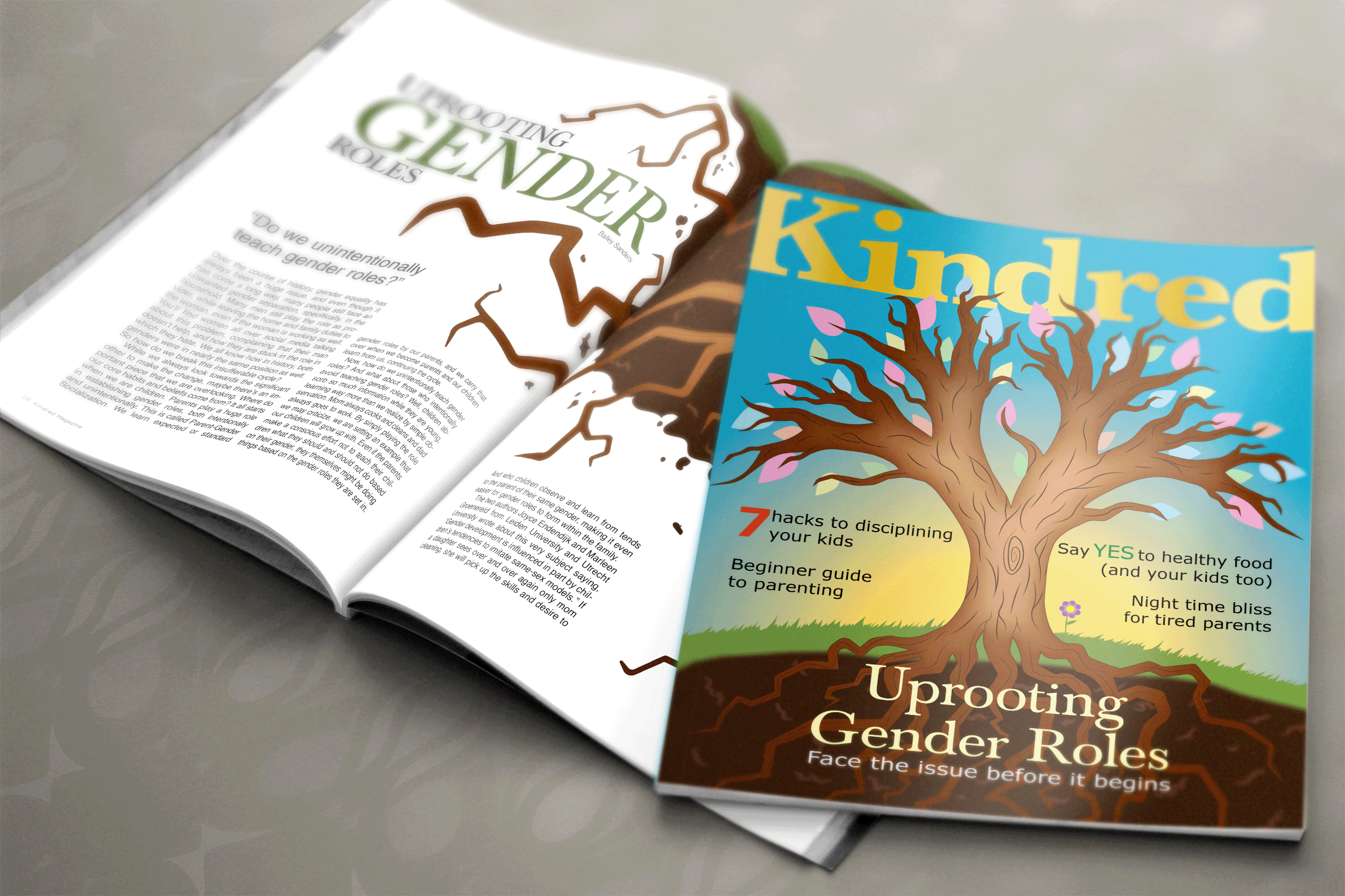
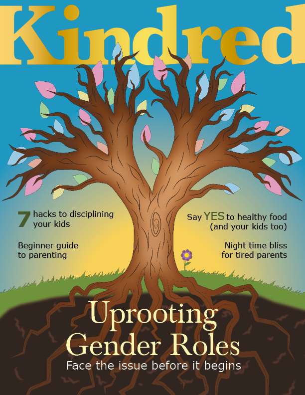
The magazine is designed for an audience of new parents, so usually ages between 20 and 30. I wanted the imagery to reflect a beautiful time of having and raising children, so in light of the cover story name Uprooting Gender Rolls, I created a tree in Illustrator with colorful leaves that represent all the different people in this world. I placed the cover story in the roots of the tree with the sub articals along the side of the trunk.
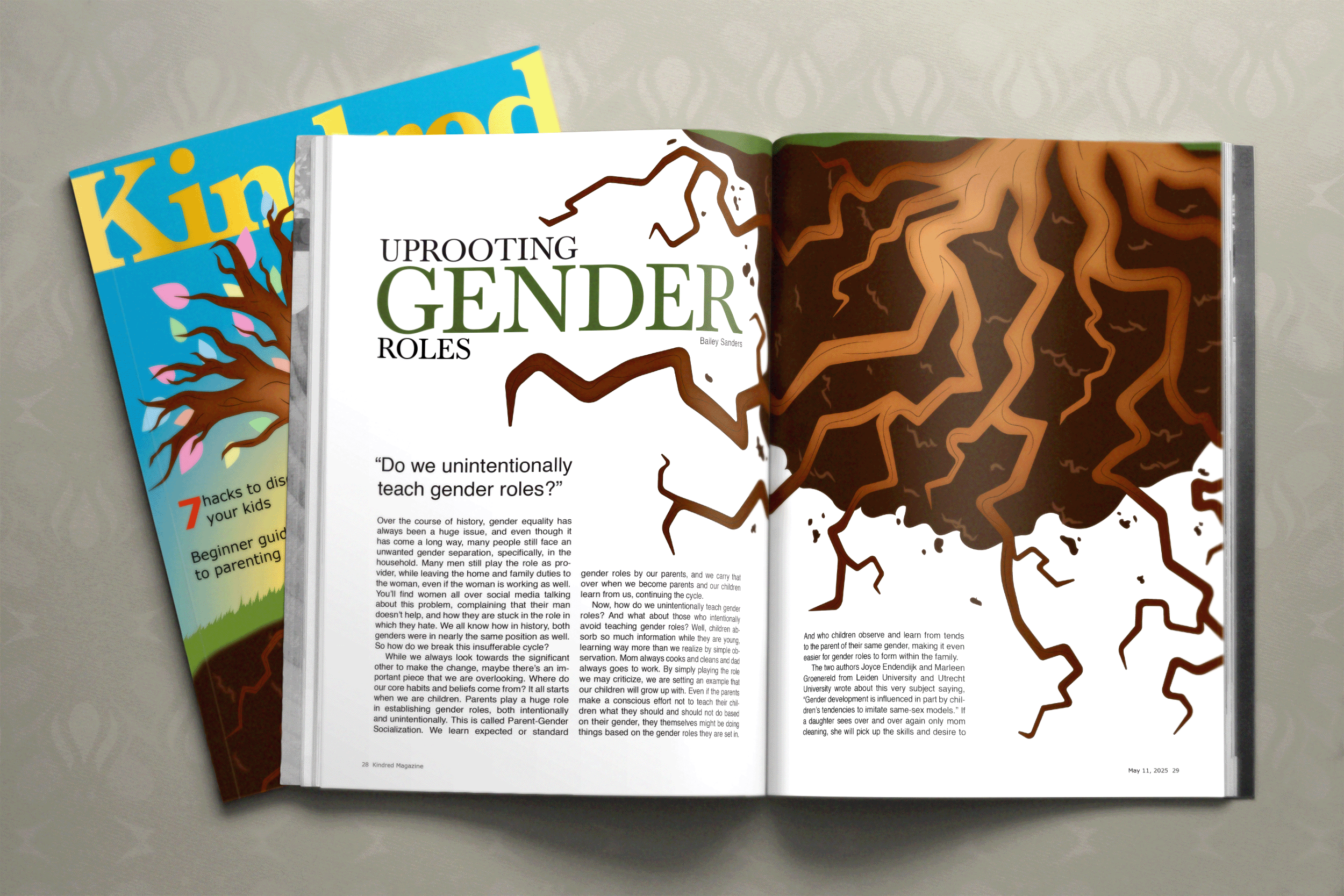
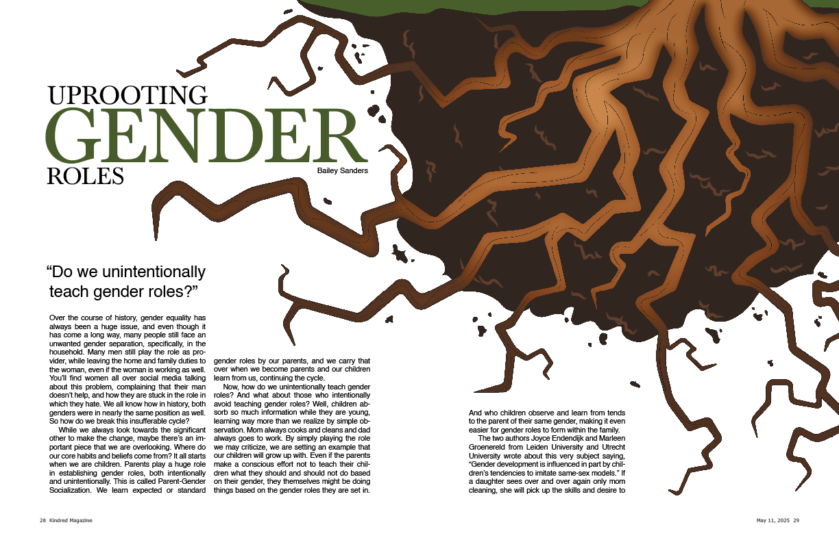
For the spread, I made the roots the main part of the illustration, with dirt around it as if it was pulled out of the ground. I wanted the roots to look, not ominous, but somewhat alarming as the message of the artical is more serious and important. The roots are spread along the pages, like they are growing out of control and need intervention. I went with an earthy tone for the title to match the grass along the top.
Baskerville was chosen for the title as it is a very strong typeface. Helvetica is the body typeface to compliment Baskerville as it is a very simple sans serif. I took a pullquote and put it on the top of the artical, using it more like a lead in. I really wanted a powerful line that hooks readers attention before they flip to the next pretty picture.