Graphic Design and Photography

Children’s Storybook
Challenge:
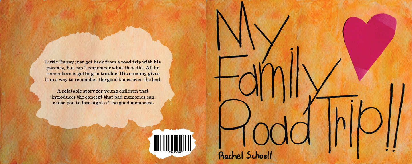
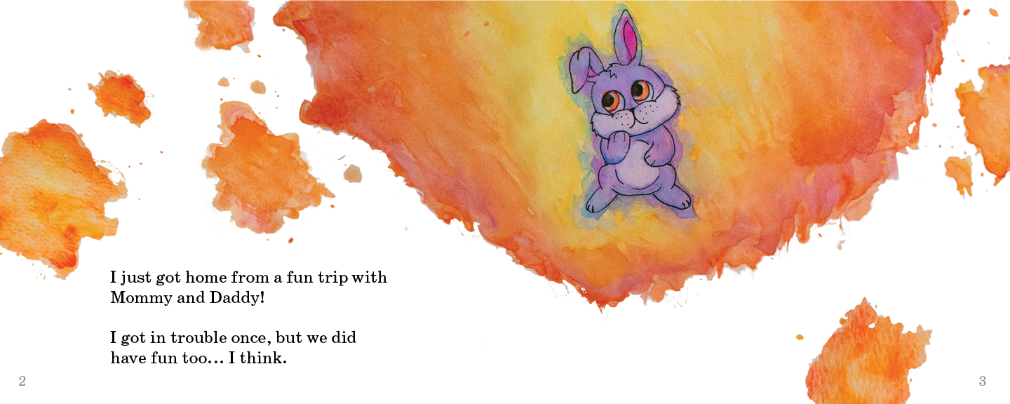
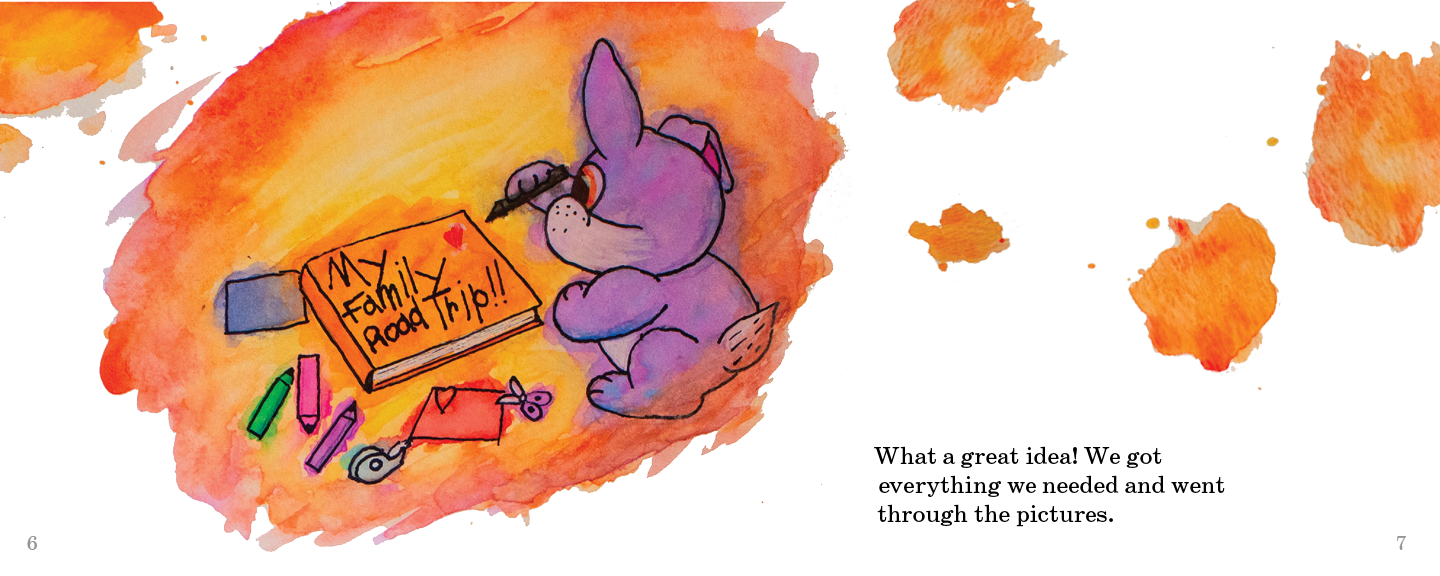
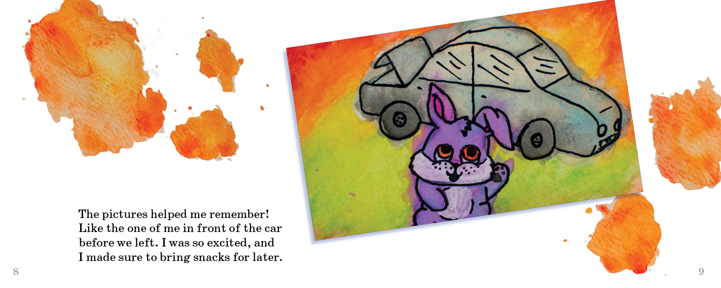
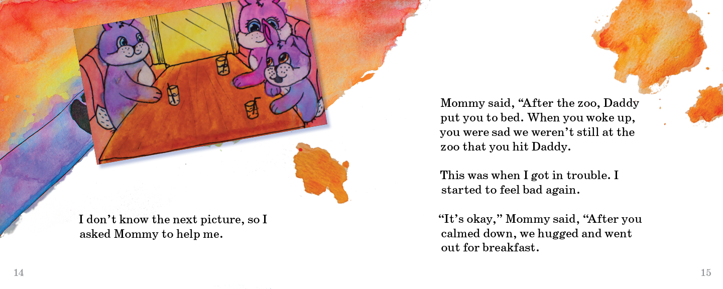
I wanted to create a story for children 5-7 years old that is both beautiful to look at and tells a good, unique lesson. I went with a story that is about a little bunny who went on a road trip with his parents. When he tries to talk about it, he struggles to remember anything other than getting in trouble once. His mom comes up with the idea to put together a photo album and put in pictures from the trip to help him remember. As he does this, all the good memories come rushing back, and in the end, he barely remembers he even got in trouble.
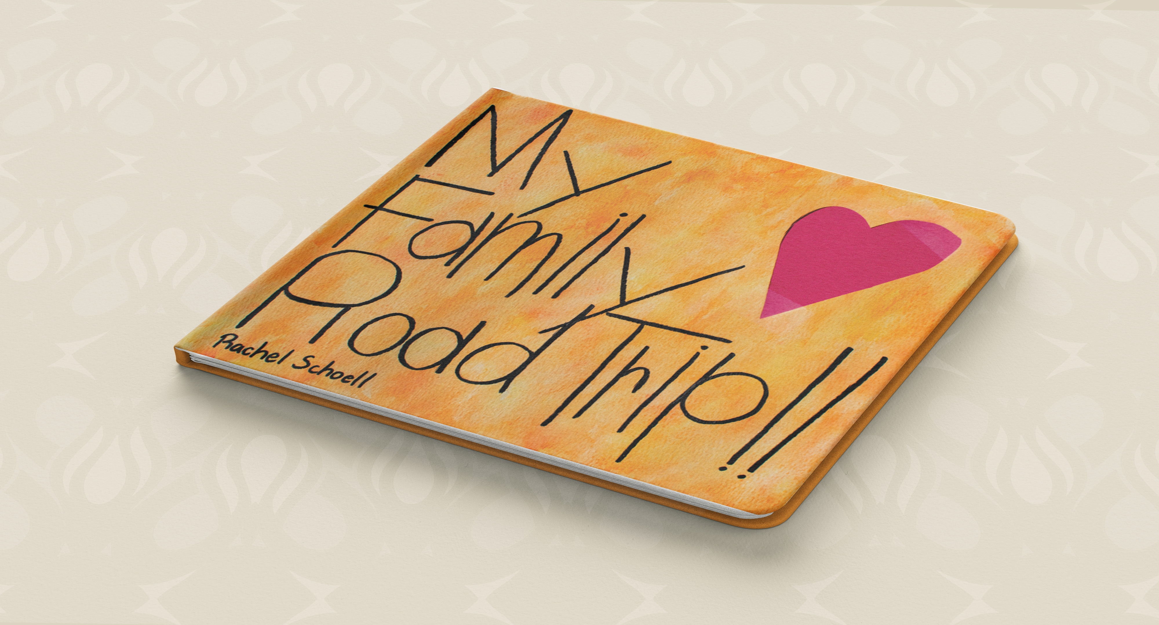
All imagery is done with watercolor. I wanted to have a fun, almost messy charm that a project a child worked on would give. The title on the cover is hand writen and designed to, again, look like a child did it. I have learned a lot about childrens handwriting so i used some of those patterns to create a look that is not only child like, but still legible
The type inside the book and on the back cover is Century Schoolbook at 18 point. I did research and found that is a popular font choice for childrens books due to the large x-height and overall clean look. I went with 18 point because during research, I found childrens books should be between 16 and 24 point. I went slightly bigger than 16, but not overpowering on the page.